There aren’t *actual* cats in the post. No. That would be silly. Cats is our word for our FREAKING NEW EXCITING CATALOGS WHAT I MADE EARLIER!
Yes. Not cats. Catalogs. They have been Continue reading Cats In The Post
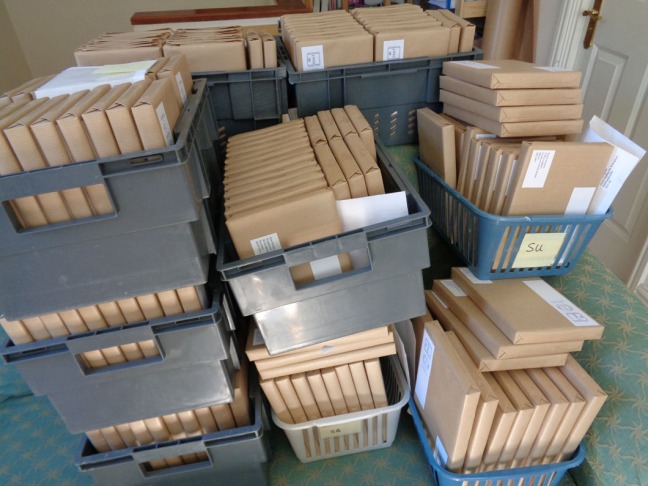
There aren’t *actual* cats in the post. No. That would be silly. Cats is our word for our FREAKING NEW EXCITING CATALOGS WHAT I MADE EARLIER!
Yes. Not cats. Catalogs. They have been Continue reading Cats In The Post

Okay, in the previous post I talked about how being pretty ain’t enough when it comes to jazzing up someone’s experience of their daily post.
If you want to be a good envelope, you have to Continue reading Pushing the Envelopes

I asked myself today, after visiting the new Yinka Shonibare exhibit “British Library” at the Turner Contemporary Museum yesterday, what if everything that came through your letterbox were wonderful?
I like to make my own envelopes, and the more over engineered they are, the more delightful and ridiculous I find them.
So, I decided today I’d make a bunch of pretty envelopes.
But, given that I’m thinking about direct marketing, it became clear to me after making 8, that a pretty envelope was not enough.
Even a lot of pretty envelopes was not going to have the effect I wanted – to deliver joy every day through a letterbox.
Lesson 1: It is not enough to be beautiful.
This introduces stage 2, which I will develop later.


Preparing the styling of a product shoot, spent the morning rootling around Fieldstaff Antiques.
Text image text image text image. I think I’m making some progress here.


Was talking this week to a few colleagues about how the past can hold back the possibilities of a tool or technology, because, Continue reading Grids? What grids?

Working on the top secret commercial brief for Design Competition today and was given warning by Isabella that the client indicated they wanted moodboards.
I don’t know the first thing about them, so I asked Google, who fortunately has done a lot of research on the topic.
This article by Paul Wyatt and Tom May on CreativeBloq seems like a good place to start. I like that it advocates old school foam boards; physical process! My favourite!
[Image from Refinery 29 of stylist Linda Rodin’s inspiration wall/door/closet]

First go at a hi key type image, an inverse of my original colour copier image for my lo-fi layout.
And here’s a nice post-production video tutorial by Jake Garn.

Experimenting with “hand drawn type” – also known in this case as handwriting – for body text. I want to create Continue reading Lo Fi Layout

Playing with different ways to manipulated typography. I have figured out that Continue reading Call Now!
